
If you’re not thinking mobile-first, you’re already behind. More than 58% of all web traffic comes from mobile devices, and Google has been using mobile-first indexing since 2019. Yet many websites still treat mobile optimization as an afterthought.
Here’s the truth: mobile SEO isn’t just about making your site look good on phones. It’s about creating an experience that Google loves and users can’t resist. When you get it right, you’ll see better rankings, more traffic, and higher conversions.
In this comprehensive guide, I’ll walk you through everything you need to know about mobile SEO in 2025. We’ll cover the technical foundations, user experience optimization, and advanced strategies that actually move the needle.
What Is Mobile SEO (And Why It Matters in 2025)

Mobile SEO is the practice of optimizing your website to rank well in search results when people search on mobile devices. But it extends far beyond responsive design or fast loading times.
Mobile SEO involves:
- Creating a mobile-friendly website structure
- Optimizing for mobile user behavior patterns
- Ensuring fast loading speeds on mobile networks
- Making content easily readable on small screens
- Optimizing for voice and visual search
- Improving local search visibility
Think of it as creating a website that works perfectly for someone scrolling through their phone while waiting for coffee or searching for a restaurant while walking down the street.
Why Mobile SEO Is Important for Ranking and Revenue
Google switched to mobile-first indexing in 2019, which means they primarily use the mobile version of your site for ranking and indexing. If your mobile site is slow, broken, or hard to use, your rankings will suffer across all devices.
But rankings are just the beginning. Mobile users behave differently than desktop users. They’re often looking for quick answers, nearby businesses, or easy-to-complete actions. When your site meets these needs, you’ll see:
- Higher click-through rates from search results
- Better user engagement metrics
- Increased conversions and sales
- Lower bounce rates
- More repeat visitors
Companies that excel at mobile SEO often see 20-30% increases in organic traffic and even bigger jumps in mobile conversions.
Mobile Usage Trends: Key Stats You Need to Know
The numbers tell a clear story about why mobile SEO matters:
- Over 58% of all website traffic comes from mobile devices
- More than 63% of Google searches happen on mobile
- Mobile commerce accounts for over 54% of all e-commerce sales
- 92% of mobile users have their phone within arm’s reach 24/7
- Voice searches make up 27% of all mobile searches
- Local searches are 3x more likely to happen on mobile
These trends aren’t slowing down. Mobile usage continues to grow as phones become more powerful and 5G networks expand globally.
How Mobile-First Indexing Affects Your SEO
Mobile-first indexing means Google primarily uses the mobile version of your website’s content for indexing and ranking. Instead of looking at your desktop site first, Google’s crawlers check out your mobile site and use that to determine where you should rank.
This shift happened because most people now search on mobile devices. Google wants to show results based on what users will actually see and experience.
Here’s what this means for you: if your mobile site is missing content, has broken links, or loads slowly, those problems will hurt your rankings on both mobile and desktop searches.
How Google Crawls and Indexes Mobile vs. Desktop
Google uses a mobile user agent (Googlebot smartphone) to crawl your site. This bot sees your site exactly like a mobile user would. It checks:
- How fast your pages load on mobile
- Whether all your content is accessible
- If your images and videos work properly
- How easy it is to navigate your site
- Whether your structured data is present
The key difference from desktop crawling is that mobile crawlers are more sensitive to speed and usability issues. A problem that might be minor on desktop can be a major ranking factor on mobile.
Google also looks at mobile-specific signals like:
- Touch-friendly button sizes (minimum 44×44 pixels)
- Text that’s readable without zooming (minimum 16px)
- Content that fits the screen width
- Easy-to-use navigation menus
Steps to Get Your Site Ready
Getting ready for mobile-first indexing requires attention to detail. Here’s your action plan:
Step 1: Audit Your Mobile Content
Make sure all the content on your desktop site appears on mobile. This includes text, images, videos, and links. Many sites hide content on mobile to save space, but this can hurt your rankings.
Step 2: Check Your Site Speed
Use Google’s PageSpeed Insights tool to test your mobile loading speed. Aim for a score of 85 or higher, and focus on the Core Web Vitals metrics.
Step 3: Verify Mobile Usability
Go to Google Search Console and check the Mobile Usability report. Fix any issues like text that’s too small, clickable elements too close together, or content wider than the screen.
Step 4: Test Your Structured Data
Use Google’s Rich Results Test to make sure your structured data works on mobile. This helps your site show up in rich snippets and other enhanced search features.
Responsive Design vs. Dynamic Serving vs. Separate URLs
Which Setup Is Best for Mobile SEO?
You have three main options for serving mobile content, and Google has a clear favorite:
Responsive Design (Google’s Recommendation)
Responsive design uses the same HTML code for all devices but adjusts the layout with CSS. This is Google’s preferred approach because:
- There’s only one URL to crawl and index
- No risk of duplicate content issues
- Link equity isn’t split between multiple URLs
- Easier to maintain and update
- Less chance for configuration errors
Dynamic Serving
Dynamic serving uses the same URL but serves different HTML based on the user’s device. This can work well but requires careful implementation to avoid cloaking issues.
Separate Mobile URLs (m.example.com)
This approach uses different URLs for mobile and desktop versions. While it can work, it’s the most complex option and has the highest risk of SEO problems.
Unless you have specific technical requirements, responsive design is almost always the best choice for mobile SEO.
Common Mistakes with Mobile Site Configurations
Even with responsive design, there are common mistakes that can hurt your mobile SEO:
Mistake 1: Hiding Important Content
Don’t hide key content in tabs or accordions just to save space. Google wants to see all your important content easily accessible.
Mistake 2: Using Intrusive Pop-ups
Pop-ups that cover the main content on mobile can trigger Google’s intrusive interstitial penalty. Keep pop-ups small or delay them until after the user has engaged with your content.
Mistake 3: Blocking CSS or JavaScript
Make sure Googlebot can access all the files needed to render your mobile site properly. Check your robots.txt file to ensure you’re not blocking important resources.
Mistake 4: Slow Loading Images
Large, unoptimized images are one of the biggest mobile performance killers. Use responsive images and modern formats like WebP.
Core Web Vitals and Mobile Performance Optimization
2024 Core Web Vitals Breakdown: LCP, FID (INP), CLS
Core Web Vitals are Google’s official page experience metrics, and they’re especially important for mobile SEO. Let’s break down each metric:
Largest Contentful Paint (LCP)
LCP measures how long it takes for the largest content element to load. For mobile, aim for under 2.5 seconds. This is usually your hero image, main heading, or primary content block.
Common LCP issues on mobile:
- Large, unoptimized images
- Slow server response times
- Render-blocking JavaScript
- Web fonts loading slowly
First Input Delay (FID) – Now Interaction to Next Paint (INP)
Google is transitioning from FID to INP in 2024. INP measures how quickly your site responds to user interactions like taps, clicks, and scrolls. Aim for under 200 milliseconds.
INP is crucial for mobile because users expect instant responses when they tap buttons or scroll through content.
Cumulative Layout Shift (CLS)
CLS measures visual stability – how much your content moves around while loading. On mobile screens, even small shifts can be jarring. Aim for a score under 0.1.
Common CLS problems on mobile:
- Images loading without defined dimensions
- Ads or pop-ups appearing suddenly
- Font swaps that change text size
- Dynamic content injection
How to Diagnose Mobile Speed Issues
Finding mobile speed problems requires the right approach. Here’s how to diagnose issues effectively:
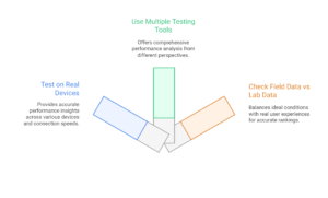
Step 1: Test on Real Devices
Don’t just resize your browser window. Test on actual mobile devices with different screen sizes and connection speeds. Use Chrome DevTools’ device emulation, but verify with real devices too.
Step 2: Use Multiple Testing Tools
Different tools show different aspects of performance:
- Google PageSpeed Insights for Core Web Vitals
- GTmetrix for detailed waterfall analysis
- WebPageTest for real-world testing conditions
- Google Search Console for field data
Step 3: Check Field Data vs Lab Data
Lab data shows what’s possible under ideal conditions. Field data shows what real users experience. Both matter, but field data is what Google uses for rankings.
Best Tools for Measuring Mobile Performance
Here are the essential tools for mobile performance testing:
This free tool gives you both lab and field data, plus specific recommendations for improvement. It’s directly from Google, so it reflects what they consider important.
Chrome DevTools
Built into Chrome browser, DevTools lets you throttle connection speed, emulate different devices, and analyze performance in real-time.
The Core Web Vitals report shows real user data from your site. This is the data Google actually uses for ranking, making it incredibly valuable.
Lighthouse
Available in Chrome DevTools or as a standalone tool, Lighthouse provides comprehensive performance audits with actionable recommendations.
Improving Load Time on Mobile: Action Plan
Here’s a step-by-step plan to improve your mobile loading speed:
Phase 1: Quick Wins (1-2 hours)
- Enable compression (gzip/brotli) on your server
- Optimize images with tools like TinyPNG or ImageOptim
- Remove unused plugins and scripts
- Enable browser caching
Phase 2: Medium-Impact Changes (1-2 days)
- Implement lazy loading for images and videos
- Minify CSS and JavaScript files
- Use a Content Delivery Network (CDN)
- Optimize web fonts with font-display: swap
Phase 3: Advanced Optimization (1-2 weeks)
- Implement critical CSS inline
- Use service workers for caching
- Consider AMP for content pages
- Optimize database queries and server response times
Mobile User Experience (UX) That Boosts Rankings
Mobile UX/UI Trends for 2025
Mobile UX trends evolve quickly, but several key patterns are dominating 2025:
Thumb-Friendly Design
Design for one-handed use. Place important buttons and links within easy reach of the thumb. This typically means the bottom two-thirds of the screen for most phones.
Minimalist Navigation
Complex navigation menus don’t work on mobile. Use simple, icon-based navigation or hamburger menus that are easy to understand at a glance.
Micro-Interactions
Small animations and feedback help users understand what’s happening. Think button presses that show a subtle animation or loading indicators that keep users engaged.
Voice Interface Integration
More sites are adding voice search buttons and voice-controlled navigation. This trend will only grow as voice search becomes more common.
Design Tips for Seamless Mobile Navigation
Good mobile navigation can make or break your user experience. Here’s how to get it right:
Keep It Simple
Limit your main navigation to 5-7 items maximum. If you need more, use a secondary menu or organize items into categories.
Make Buttons Big Enough
Touch targets should be at least 44×44 pixels. Anything smaller is hard to tap accurately, especially for users with larger fingers.
Use Clear Labels
Don’t make users guess what icons mean. Use text labels or make sure your icons are universally understood.
Provide Visual Feedback
When users tap something, they should immediately see a response. This could be a color change, animation, or loading indicator.
Touch-Friendly Design and Button Placement
Mobile users interact with their screens very differently than desktop users with a mouse. Here’s how to design for touch:
The Thumb Zone
Most users hold their phone in one hand and navigate with their thumb. The easiest area to reach is the bottom center of the screen. The hardest is the top corners.
Button Spacing
Leave enough space between clickable elements. When buttons are too close together, users accidentally tap the wrong thing, leading to frustration.
Swipe Gestures
Consider adding swipe functionality for common actions like navigating between pages or deleting items. But always provide alternative ways to perform the same actions.
Form Design
Mobile forms need special attention. Use the right input types (email, phone, number) to trigger appropriate keyboards. Keep forms short and use auto-fill whenever possible.
Voice Search and Visual Search: Mobile Optimization Tips
Why Voice Search Is Crucial on Mobile
Voice search is exploding on mobile devices. People use voice search when they’re driving, cooking, or have their hands full. It’s convenient and often faster than typing on a small screen.
Voice searches tend to be:
- Longer and more conversational
- Question-based rather than keyword-based
- Local-focused (“near me” searches)
- Action-oriented (“how to” or “what is”)
This means your mobile SEO strategy needs to account for how people actually speak, not just how they type.
How to Optimize for Voice Queries
Voice search optimization requires a different approach than traditional SEO:
Target Long-Tail, Conversational Keywords
Instead of optimizing for “pizza restaurant,” optimize for “where’s the best pizza restaurant near me?” Voice searches sound like natural speech.
Create FAQ-Style Content
Structure content to answer specific questions. Use headings that mirror how people ask questions, then provide clear, concise answers.
Focus on Local SEO
Many voice searches are local. Make sure your Google My Business profile is complete and accurate. Include location-specific keywords naturally in your content.
Optimize for Featured Snippets
Voice assistants often read featured snippet results. Structure your content to answer questions directly and concisely.
Use Natural Language
Write like people talk. Use contractions, casual language, and complete sentences rather than keyword-stuffed phrases.
Using Images? Get Ready for Visual Search Optimization
Visual search is becoming more important as phone cameras improve and AI gets better at understanding images. People can now search by taking photos of products, landmarks, or text.
Optimize Image File Names
Use descriptive file names instead of generic ones. “red-running-shoes-nike.jpg” is better than “IMG_1234.jpg.”
Write Detailed Alt Text
Alt text helps search engines understand your images. Be descriptive but natural. Include relevant keywords without stuffing.
Use High-Quality Images
Visual search works better with clear, high-resolution images. But balance quality with file size for mobile performance.
Add Image Structured Data
Use schema markup to provide more context about your images. This helps search engines understand and categorize your visual content.
Structured Data and Mobile-Specific Schema
Why Schema Helps Mobile SEO
Structured data helps search engines understand your content better, which is especially important for mobile SEO. On mobile devices, screen space is limited, so rich snippets and enhanced search results stand out even more.
Schema markup can help your mobile listings show:
- Star ratings and reviews
- Price information
- Event dates and times
- Recipe cooking times
- Business hours and contact info
- Product availability
These enhanced results take up more space in mobile search results and often have higher click-through rates.
Types of Schema That Work Best on Mobile
Some types of structured data are particularly effective for mobile users:
Local Business Schema
Essential for any business with a physical location. Include address, phone number, hours, and service areas. Mobile users often need this information quickly.
FAQ Schema
FAQ structured data can help your content appear in the “People also ask” section, which is prominent on mobile search results.
Review Schema
Star ratings in search results are eye-catching on mobile screens and can significantly improve click-through rates.
Event Schema
Mobile users often search for events on the go. Event schema can display dates, times, and locations directly in search results.
Recipe Schema
If you publish recipes, this schema can show cooking times, ratings, and calorie information in search results.
How to Add Mobile-Friendly Structured Data
Adding structured data doesn’t have to be complicated:
Step 1: Choose Your Schema Types
Visit Schema.org and identify which types of structured data apply to your content. Start with the most relevant ones for your business.
Step 2: Generate the Code
Use Google’s Structured Data Markup Helper or tools like Schema.dev to generate the JSON-LD code. JSON-LD is easier to implement and maintain than other formats.
Step 3: Add to Your Site
Place the JSON-LD code in the head section of your HTML or use a plugin if you’re on WordPress.
Step 4: Test Your Implementation
Use Google’s Rich Results Test tool to verify your structured data is working correctly. Fix any errors before going live.
Step 5: Monitor Performance
Check Google Search Console’s Enhancement reports to see how your structured data is performing and whether there are any issues.
Local SEO for Mobile Users
How Mobile and Local Search Work Together
Mobile and local search are practically inseparable. When people search for restaurants, shops, or services on their phones, they usually want something nearby.
Google recognizes this behavior and has made local search results more prominent on mobile devices. You’ll often see:
- Map packs at the top of results
- “Near me” suggestions
- Location-based recommendations
- Click-to-call buttons
- Driving directions
This creates huge opportunities for local businesses to capture mobile traffic.
Actionable Tips to Drive Local Traffic from Mobile
Here’s how to optimize for local mobile search:
Claim and Optimize Your Google My Business Profile
This is your most important local SEO asset. Make sure your profile includes:
- Accurate business name, address, and phone number
- Current business hours (including holiday hours)
- High-quality photos of your business
- Regular posts and updates
- Responses to customer reviews
Use Location-Specific Keywords
Include city names, neighborhoods, and local landmarks in your content. But do it naturally – don’t stuff keywords.
Get Local Reviews
Encourage satisfied customers to leave reviews on Google, Yelp, and other relevant platforms. Respond to all reviews, both positive and negative.
Create Location-Specific Content
Write about local events, news, and topics that matter to your community. This helps establish local relevance.
Ensure NAP Consistency
Your Name, Address, and Phone number should be identical across all online platforms and directories.
Optimizing GMB Profiles for Mobile Discovery
Your Google My Business profile is often the first thing mobile users see when they search for your business. Here’s how to optimize it:
Add All Relevant Business Categories
Choose the most specific primary category, then add relevant secondary categories. This helps Google understand exactly what your business does.
Upload High-Quality Photos
Include photos of your storefront, interior, products, and team. Mobile users rely heavily on visual information when making decisions.
Use Google My Business Posts
Regular posts keep your profile active and give you more opportunities to show up in local search results. Share updates, offers, and events.
Add Attributes
Use GMB attributes to highlight important features like “wheelchair accessible,” “free Wi-Fi,” or “outdoor seating.” Mobile users often filter results based on these attributes.
Monitor Questions and Answers
People can ask questions directly on your GMB profile. Monitor these regularly and provide helpful answers.
Mobile SEO Audit: Checklist and Tools
Mobile SEO Audit Checklist (2025)
Use this comprehensive checklist to audit your mobile SEO:
Technical Mobile SEO
- Site loads in under 3 seconds on mobile
- All content is accessible without horizontal scrolling
- Text is readable without zooming (minimum 16px font size)
- Touch elements are at least 44×44 pixels
- No intrusive pop-ups or interstitials
- Mobile-friendly test passes in Google Search Console
- Core Web Vitals scores are in the green
Content and User Experience
- All important content appears on mobile
- Navigation is easy to use with thumbs
- Forms are optimized for mobile input
- Images are optimized and load quickly
- Videos play properly on mobile devices
- Contact information is easy to find and tap
Local and Voice Search
- Google My Business profile is complete and accurate
- Content includes conversational, long-tail keywords
- FAQ sections answer common questions
- Local business schema is implemented
- NAP information is consistent across platforms
Performance and Speed
- Images are compressed and use modern formats
- CSS and JavaScript are minified
- Browser caching is enabled
- CDN is configured properly
- Server response times are under 200ms
Must-Have Tools for Mobile SEO Analysis
These tools will help you identify and fix mobile SEO issues:
Free Tools
- Google Search Console – Essential for mobile usability reports
- Google PageSpeed Insights – Core Web Vitals testing
- Google Mobile-Friendly Test – Quick mobile compatibility check
- Chrome DevTools – Real-time mobile testing and debugging
Premium Tools
- SEMrush – Comprehensive mobile SEO analysis
- Ahrefs – Mobile ranking tracking and competitor analysis
- Screaming Frog – Technical SEO auditing with mobile focus
- GTmetrix – Detailed performance analysis
Common Issues to Watch Out For
Here are the most common mobile SEO problems and how to spot them:
Slow Loading Speed
Use PageSpeed Insights to identify speed issues. Look for problems like large images, render-blocking resources, or slow server response times.
Poor Mobile Usability
Check Google Search Console’s Mobile Usability report. Common issues include text too small to read, clickable elements too close together, and content wider than screen.
Missing or Hidden Content
Compare your mobile and desktop versions. Make sure all important content, including structured data, appears on both versions.
Faulty Redirects
If you use separate mobile URLs, ensure redirects work properly in both directions. Test with different devices and user agents.
Mobile SEO FAQs
How Often Should I Audit My Mobile SEO?
You should perform a basic mobile SEO check monthly and a comprehensive audit quarterly. However, monitor these things continuously:
- Core Web Vitals scores
- Mobile usability issues in Search Console
- Mobile traffic and rankings
- Page loading speeds
Set up alerts in Google Search Console to notify you of any mobile usability issues as they arise.
Does Mobile SEO Affect Desktop Rankings?
Yes, absolutely. Since Google uses mobile-first indexing, your mobile site’s performance directly impacts rankings on all devices. If your mobile site is slow or has usability issues, it will hurt your desktop rankings too.
This is why it’s crucial to ensure your mobile site has all the same content and functionality as your desktop version.
Can I Rank Without a Mobile-Friendly Site?
In 2025, it’s extremely difficult to rank well without a mobile-friendly site. Google has been prioritizing mobile-friendly sites since 2015, and with mobile-first indexing, this has become even more critical.
Even if you somehow manage to rank without mobile optimization, you’ll lose most of your mobile traffic due to poor user experience. The bounce rate will be terrible, and users won’t convert.
Final Thoughts
The key is to stay focused on user experience. When you create a mobile site that users love, Google will love it too. Focus on speed, usability, and providing real value to your mobile visitors.
Mobile SEO might seem complex, but it’s really about understanding how people use their phones and optimizing for those behaviors. Start with the basics, measure your results, and keep improving. Your mobile users and your search rankings will thank you.
