
If you’ve ever wondered why some websites seem to effortlessly convert visitors into customers while others struggle to get any action at all, you’re about to find out. The secret often lies in those little prompts scattered throughout successful websites—the calls to action, or CTAs.
In this comprehensive guide, we’ll dive deep into everything you need to know about calls to action. From understanding what they are and why they matter, to crafting CTAs that actually convert and measuring their success. By the end, you’ll have all the tools and knowledge needed to transform your passive visitors into active participants in your business.
What Is a Call to Action?

Let’s start with the basics. Understanding what a call to action really is will set the foundation for everything else we’ll cover.
Simple Definition
A call to action (CTA) is a prompt that tells users what to do next. It’s your way of guiding visitors toward taking a specific action, whether that’s clicking “Buy Now,” filling out a “Sign Up” form, or simply hitting “Learn More.”
Think of CTAs as friendly nudges. They’re like having a helpful sales assistant who says, “Hey, if you like what you see, here’s what you can do next.” Without these prompts, visitors might love your content but have no clear idea about what step to take next.
CTAs can take many forms. They might be a brightly colored button on your homepage, a text link at the end of a blog post, or even a pop-up that appears when someone’s about to leave your site. The key is that they’re always asking for some kind of action.
What makes a CTA different from regular content is its purposeful direction. While your blog post might inform or entertain, your CTA has one job: to move people from passive readers to active participants. It’s the bridge between interest and action.
Why CTAs Matter
Here’s the thing about human psychology: we often need to be told what to do next. Even when people are interested in what you’re offering, they might not take action without clear direction. That’s where CTAs come in—they drive engagement and turn curious visitors into leads, customers, or subscribers.
Without CTAs, you’re essentially hoping that visitors will figure out on their own what you want them to do. Some might, but most won’t. They’ll read your content, think “that’s nice,” and then leave to check their social media or answer emails. Your chance is gone.
According to HubSpot’s 2024 Marketing Report, companies using strategic CTAs see conversion rates increase by up to 42% compared to those without clear action prompts.
But when you include strategic CTAs, something magical happens. You start seeing actual results from your website traffic. Those analytics numbers that showed high bounce rates? They start improving. Those email lists that grew at a snail’s pace? They start expanding. Those product pages that generated lots of views but few sales? They start converting.
CTAs also serve another crucial purpose: they help you understand your audience better. When people click on your CTAs, they’re telling you what interests them most. This data becomes invaluable for improving your marketing strategy and creating even better content and offers.
Types of Calls to Action
Not all CTAs are created equal. Different situations call for different types of prompts, and understanding your options will help you choose the right approach for each scenario.
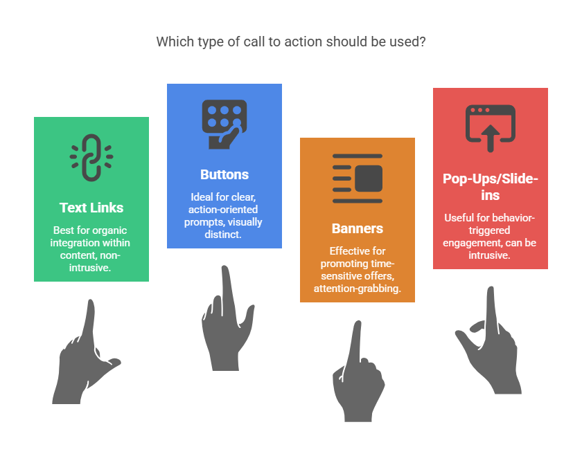
Text Links
Text links are the simplest form of CTAs. These are clickable phrases embedded naturally within your content—in blog posts, emails, or even social media captions. They work because they feel organic and non-pushy.
For example, in the middle of a blog post about email marketing, you might include a sentence like: “If you want to see how successful companies craft their welcome emails, check out these proven templates.” The linked phrase becomes your CTA.
Text link CTAs are particularly effective because they don’t interrupt the reading experience. They feel like a natural extension of your content. People who are genuinely interested will click, while others can continue reading without feeling pressured.
The key to successful text link CTAs is making them feel helpful rather than salesy. Instead of “Click here for our product,” try “See how other businesses solved this exact problem.” The difference in approach can dramatically impact your click-through rates.
Buttons
Button CTAs are the workhorses of conversion optimization. These visually distinct elements are designed to stand out on your page and practically beg to be clicked. They’re perfect for situations where you want to make taking action as obvious and easy as possible.
Good button CTAs have several characteristics: they use contrasting colors that pop against your background, they’re large enough to be easily clickable (especially on mobile devices), and they use action-oriented text that clearly communicates what will happen when clicked.
• “Start Your Free Trial”
• “Download the Guide”
• “Get My Discount”
• “Join the Community”
The beauty of button CTAs is their versatility. You can place them strategically throughout your website—in your header, at the end of blog posts, on product pages, or even floating in a corner of the screen. Each placement serves a different purpose and catches visitors at different stages of their journey.
One mistake many businesses make is using generic button text like “Submit” or “Click Here.” These phrases don’t tell people what value they’ll get from clicking. Always focus on the benefit or outcome instead.
Banners
Banner CTAs are those horizontal strips you often see at the top or bottom of websites. They’re like digital billboards designed to catch attention and promote a specific offer or action. When done right, they can be incredibly effective at generating leads and sales.
The best banner CTAs usually promote something valuable and time-sensitive. Think “Download Your Free Marketing Checklist” or “Save 30% This Week Only.” They work because they offer immediate value and create a sense of urgency.
Banner placement matters enormously. Top-of-page banners get seen by almost everyone but can sometimes feel intrusive. Bottom-of-page banners catch people after they’ve consumed your content and might be more ready to take action. Some websites even use sticky banners that follow users as they scroll.
One pro tip: make sure your banner CTAs are easily dismissible. Nothing frustrates visitors more than a banner they can’t close. Include a clear X button, and consider showing the banner only to new visitors or limiting how often it appears to returning users.
Pop-Ups and Slide-ins
Before you roll your eyes, hear me out. Yes, pop-ups can be annoying when done wrong, but they can also be incredibly effective when done right. The key is using them strategically based on user behavior rather than just timing.
Research from Sumo’s 2024 Conversion Report shows that well-timed, behavior-triggered pop-ups achieve an average conversion rate of 3.09%, significantly higher than static CTAs.
Modern pop-up CTAs are smart. They might appear when someone has scrolled 70% through your blog post (showing they’re engaged), when they’ve spent a certain amount of time on your site, or when they show “exit intent” by moving their mouse toward the browser’s close button.
Slide-in CTAs are often less intrusive than traditional pop-ups. They might slide in from the corner of the screen or appear as a small banner at the bottom. They get attention without completely interrupting the user experience.
The secret to successful pop-up and slide-in CTAs is relevance and timing. A pop-up offering a discount on running shoes to someone reading your article about marathon training makes sense. The same pop-up appearing immediately when someone lands on your homepage feels spammy.
Examples of Effective CTAs
Sometimes the best way to understand what works is to see it in action. Let’s look at some real-world examples of CTAs that consistently drive results.
From Top Websites
The biggest companies in the world have spent millions testing and optimizing their CTAs. Here’s what we can learn from them:
Netflix uses “Join Free for a Month” instead of just “Sign Up.” This CTA works because it emphasizes the benefit (free access) and removes risk (only a month commitment). It’s specific and addresses the main objection people might have about trying a new service.
Spotify goes with “Get Premium” rather than “Upgrade Now.” The word “get” feels more like receiving a gift than making a purchase. It’s subtle psychology, but it works. They’re not asking you to spend money; they’re offering you something valuable.
Mailchimp has built their business on “Sign Up Free.” This CTA removes the biggest barrier to trying their service—cost. By leading with “free,” they get people in the door, then prove their value over time.
What these examples have in common is their focus on value and benefit removal of friction. They don’t just tell people what to do; they tell people what they’ll get.
By Industry
Different industries need different approaches. What works for an e-commerce store might not work for a nonprofit, and what converts for a software company might fall flat for a local service business.
E-commerce CTAs need to be direct and remove purchase anxiety. “Add to Cart” is classic, but “Buy Now” or “Get Yours Today” can work even better. Some innovative e-commerce sites use “Yes, I Want This!” to create excitement and urgency.
SaaS (Software as a Service) companies often use “Start Free Trial” because it removes risk. Other effective variations include “Try It Free” or “Get Started Free.” The word “start” implies beginning a journey, which feels less committal than “sign up.”
Blogs and Content Sites might use “Read More” for article previews, but better options include “Get the Full Story” or “See What Happened Next.” For newsletter signups, try “Join [Number] Smart Marketers” instead of generic “Subscribe.”
Nonprofits often default to “Donate Now,” but more effective CTAs might be “Help Change a Life” or “Make Your Impact Today.” These focus on the outcome rather than the action, making donors feel more connected to the cause.
How CTAs Influence SEO and Conversions
Here’s something many people don’t realize: good CTAs don’t just improve conversions—they can actually help your search engine rankings too. It’s all connected through user engagement signals that search engines use to evaluate your content.
Improved Engagement = Better SEO
Search engines like Google pay attention to how people interact with your website. When visitors take actions—clicking CTAs, spending more time on your site, visiting multiple pages—it sends positive signals about your content quality.
Think about it: if someone lands on your blog post and immediately bounces back to Google, that suggests your content didn’t meet their needs. But if they click on your CTA to download a related guide or read another article, that indicates your content was valuable and relevant.
According to Ahrefs’ 2024 Ranking Factors Study, pages with strong user engagement signals (including CTA interactions) rank an average of 23% higher than those without clear action prompts.
These engagement metrics—time on site, pages per session, bounce rate—all factor into how search engines rank your content. Effective CTAs help improve these metrics by giving people reasons to stick around and engage more deeply with your site.
Internal link CTAs are particularly valuable for SEO. When you link from one piece of content to another relevant piece, you’re helping search engines understand the relationship between your pages and keeping visitors engaged with your site longer.
Boosting Conversion Rates
Of course, the primary purpose of CTAs is to improve conversions, and this is where they really shine. Conversion rate optimization (CRO) is essentially the art and science of getting more people to take desired actions on your website.
Strong CTAs work by reducing friction and providing clear direction. Instead of making visitors guess what they should do next, you’re explicitly guiding them toward valuable actions. This clarity can dramatically improve your conversion rates.
Consider this: if your website gets 1,000 visitors per month and 2% convert (sign up, purchase, etc.), that’s 20 conversions. But if better CTAs help you improve that conversion rate to 4%, you’ve doubled your results without getting any additional traffic.
The compound effect is even more powerful. Better CTAs don’t just improve immediate conversions—they help you capture more leads, which means more opportunities for future sales. They also help you understand your audience better, leading to more targeted marketing and even higher conversion rates over time.
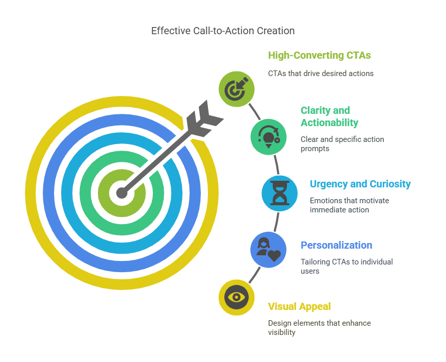
How to Write High-Converting CTAs
Now that you understand what CTAs are and why they matter, let’s get into the nitty-gritty of creating ones that actually work. Writing effective CTAs is part art, part science, and part psychology.
Keep It Clear and Actionable
The foundation of any good CTA is clarity. People should know exactly what will happen when they click, without any confusion or ambiguity. This means using specific, action-oriented language that sets clear expectations.
Start with strong action verbs: Download, Get, Start, Join, Discover, Learn, Try, Create. These words naturally prompt action and give people a clear sense of what they’re doing.
Then add value or specificity: “Download Our Free Checklist” is infinitely better than “Click Here.” The first version tells people exactly what they’ll get and emphasizes that it’s free. The second version tells them nothing except to perform a vague action.
Before and After Examples:
Weak: “Click Here”
Strong: “Download Your Free Marketing Checklist”
Weak: “Submit”
Strong: “Get My Custom Quote”
Weak: “Learn More”
Strong: “See How We Increased Sales by 40%”
Notice how the stronger versions tell people exactly what they’ll get and often include a benefit or outcome. This transparency builds trust and increases the likelihood that interested people will take action.
Another key aspect of clarity is keeping your CTA text concise. Aim for 2-5 words when possible. Longer CTAs can work, but they need to be scannable and easy to understand at a glance.
Create Urgency or Curiosity
Human psychology responds strongly to two emotions: urgency and curiosity. When you can incorporate either (or both) into your CTAs, you’ll often see significant improvements in click-through rates.
Urgency works by leveraging our fear of missing out. Phrases like “Limited Time Offer,” “Only 3 Left in Stock,” or “Offer Ends Soon” can motivate people to act now rather than putting it off. But be authentic—fake urgency can damage trust and hurt your brand.
Curiosity works by opening a loop in people’s minds that they feel compelled to close. CTAs like “See What You’re Missing,” “Discover the Secret,” or “Find Out How” create mental gaps that people want to fill.
You can also combine urgency and curiosity: “See Why Everyone’s Talking About This (Before It’s Too Late)” or “Discover What Your Competitors Don’t Want You to Know.”
Time-sensitive language doesn’t always have to be about limited offers. You can create urgency around solving problems: “Stop Wasting Time on Bad Marketing” or “End Your Sleepless Nights Tonight.”
Personalize When Possible
Personal language makes CTAs feel more relevant and less generic. Instead of speaking to everyone, you’re speaking directly to the individual reading your content.
Simple changes can make a big difference. “Start Your Free Trial” feels more personal than “Start Free Trial.” “Get My Guide” feels more individual than “Get the Guide.” These small tweaks help people visualize themselves taking the action.
If you have data about your visitors, you can personalize even further. Returning visitors might see “Welcome Back—Continue Your Journey,” while new visitors see “Start Your Journey Today.” Someone who’s been browsing your pricing page might see a CTA about scheduling a demo, while someone reading blog posts might see a content download offer.
Geographic personalization can work too: “Find Marketing Experts in [Your City]” or “Join 500+ Austin Entrepreneurs.” This approach works especially well for local businesses or services that vary by location.
Make It Visually Appealing
The best CTA copy in the world won’t convert if people don’t notice it. Visual design plays a crucial role in making your CTAs effective.
Color contrast is your friend. Your CTA should stand out from the rest of your page design. If your website uses a lot of blue, try orange or red for your CTAs. If your design is mostly neutral, a bright green or blue button can work well.
A study by Unbounce found that red CTA buttons outperformed green ones by 21% in their tests, though the optimal color varies by industry and brand context.
Size matters, especially on mobile devices. Your CTA buttons should be large enough to easily tap with a thumb, but not so large that they overwhelm your content. A good rule of thumb is making buttons at least 44 pixels tall.
Whitespace (empty space around your CTA) helps draw attention to it. Don’t crowd your CTAs with other elements. Give them room to breathe so they naturally catch the eye.
Font choice impacts readability and perception. Use fonts that are easy to read and match your brand personality. Bold, sans-serif fonts often work well for CTAs because they’re clear and authoritative.
CTA Best Practices for Digital Platforms
Different platforms require different approaches. What works on your website might not work in email, and what converts on desktop might fail on mobile. Let’s break down best practices for each major platform.
Website
Your website offers the most flexibility for CTA placement and design, but that can also make it overwhelming to know where to start. The key is thinking about user journey and placing CTAs where they’ll be most relevant and effective.
Above-the-fold placement is crucial for your primary CTA. This is the area people see without scrolling, and it should include your most important action. For most businesses, this might be “Get Started,” “Shop Now,” or “Contact Us.”
Throughout your content, use contextual CTAs that relate to what people are reading. If you’re explaining a problem, your CTA might offer a solution. If you’re sharing statistics, your CTA might offer a detailed report.
Footer CTAs catch people who have consumed your entire page and might be ready for next steps. These often work well for newsletter signups or contact forms because people have already demonstrated interest by reading to the bottom.
Sidebar CTAs work for blogs and content-heavy sites. These might promote related content, email signups, or special offers. Keep them relevant to your content and not too intrusive.
Exit-intent CTAs appear when someone is about to leave your site. These can be effective for capturing emails or promoting special offers, but use them sparingly to avoid annoying visitors.
Email CTAs have unique constraints and opportunities. You’re reaching people who have already expressed interest in your brand, so they’re often more receptive to your offers.
The golden rule for email CTAs is focus: one CTA per email works best. When you include multiple CTAs, you create decision paralysis and reduce the chance that people will take any action at all.
Your CTA should align perfectly with your email’s content and subject line. If your subject line promises “5 Tips for Better Sleep,” your CTA might be “Get Your Complete Sleep Guide.” Everything should work together toward a single goal.
Button design in email needs to account for different email clients and devices. Use HTML buttons with fallback options, and make sure they’re large enough for mobile tapping. Test your emails across different clients to ensure your CTAs display correctly.
Placement within your email matters too. Including your CTA near the top works for subscribers who are already engaged, while placing it at the bottom works for people who want to read your full content first. You can include both, but make sure they’re identical.
Mobile Devices
With more than half of web traffic coming from mobile devices, mobile-optimized CTAs aren’t optional—they’re essential. Mobile users have different behaviors and constraints that impact how they interact with CTAs.
According to Statista’s 2024 Mobile Usage Report, 58.67% of global website traffic comes from mobile devices, making mobile optimization critical for CTA success.
Thumb-friendly design is crucial. Mobile users navigate primarily with their thumbs, and your CTAs need to be easily tappable. This means making buttons large enough (at least 44 pixels), spacing them apart from other clickable elements, and placing them where thumbs naturally reach.
Loading speed affects mobile CTAs significantly. If your page takes too long to load, people will leave before they ever see your CTA. Optimize images, minimize code, and consider using simplified mobile designs that load quickly.
Mobile screens are smaller, so your CTA text needs to be even more concise and impactful. “Download Free Guide” might work better than “Download Your Free Marketing Guide” when space is limited.
Consider mobile-specific behaviors in your CTA strategy. Mobile users are often multitasking or browsing quickly, so your CTAs might need to be more attention-grabbing or offer immediate value.
Social Media
Social media CTAs work differently because the platforms control much of the user experience. You’re working within their frameworks and competing with lots of other content for attention.
Platform-specific language often works best. On Instagram, “Swipe Up” (for accounts with the feature) or “Link in Bio” are familiar CTAs that users understand. On Facebook, “Comment ‘YES’ to learn more” can boost engagement and reach.
Social media CTAs should feel native to the platform rather than overly promotional. “Tap to see more” feels more natural than “Click here to visit our website.” Work with the platform’s conventions rather than against them.
Visual CTAs often work better than text-only versions on social media. This might mean using arrows pointing to your link, call-out boxes highlighting your offer, or even text overlays on images that guide people toward action.
Story features on Instagram and Facebook offer unique CTA opportunities with features like “Swipe Up,” polls, and question stickers. These interactive elements can drive engagement and guide people toward your desired actions.
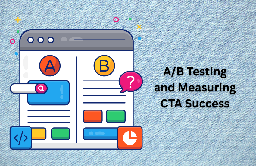
A/B Testing and Measuring CTA Success
Creating great CTAs isn’t a one-and-done process. The most successful businesses continuously test and optimize their CTAs based on real performance data. Here’s how to do it systematically.
Test Variations
A/B testing (also called split testing) is the gold standard for optimizing CTAs. The concept is simple: create two versions of your CTA, show each version to similar groups of people, and see which one performs better.
You can test almost any element of your CTAs: the text, button color, size, placement, or even the entire design. But here’s the key—only test one element at a time. If you change both the text and the color, you won’t know which change caused any improvement or decline in performance.
Start with the elements that are likely to have the biggest impact. CTA text usually has the largest effect on performance, so that’s often a good place to start. You might test “Download Free Guide” against “Get Your Free Guide” or “Start Free Trial” against “Try It Free.”
Color is another high-impact element to test. Try your current button color against a high-contrast alternative. Red, orange, and green often perform well, but the best color depends on your overall design and brand.
Placement testing can reveal surprising insights. You might discover that a CTA performs better at the top of your page rather than the bottom, or that inline CTAs within your content outperform sidebar CTAs.
Run your tests long enough to get statistically significant results. This usually means at least a few hundred interactions per variation, and ideally testing for full weeks to account for day-of-week variations in user behavior.
Track Performance Metrics
You can’t improve what you don’t measure. Tracking the right metrics will help you understand not just whether your CTAs are working, but how to make them work better.
Click-through Rate (CTR) is the most basic metric—what percentage of people who see your CTA actually click on it. This tells you how compelling and noticeable your CTA is. A good CTR varies by industry and placement, but 2-5% is typical for many website CTAs.
Conversion Rate goes deeper than clicks. Of the people who click your CTA, how many complete the desired action (sign up, purchase, download, etc.)? This metric helps you understand whether your CTA is attracting the right people and whether your landing page experience matches expectations.
Bounce Rate for CTA traffic shows whether people who click your CTA find what they expected. A high bounce rate might indicate a mismatch between your CTA promise and your landing page delivery.
Time on Page after CTA clicks can indicate engagement quality. People who spend more time on your site after clicking a CTA are more likely to eventually convert, even if they don’t take immediate action.
• Google Analytics 4 for comprehensive conversion tracking
• Hotjar or Crazy Egg for heatmaps showing click patterns
• Optimizely or VWO for advanced A/B testing
• Your email platform’s built-in analytics for email CTAs
• Google Tag Manager for custom event tracking
Set up conversion goals in Google Analytics to track when people complete desired actions after clicking your CTAs. This might be reaching a thank-you page, completing a form, or making a purchase.
Don’t just look at individual CTA performance—analyze the overall user journey. Someone might not convert immediately after clicking your first CTA, but they might sign up for your newsletter and purchase something weeks later. Understanding these longer conversion paths helps you see the full value of your CTAs.
Common CTA Mistakes to Avoid
Even well-intentioned marketers often make CTA mistakes that hurt their conversion rates. Learning what not to do is just as important as learning what works.
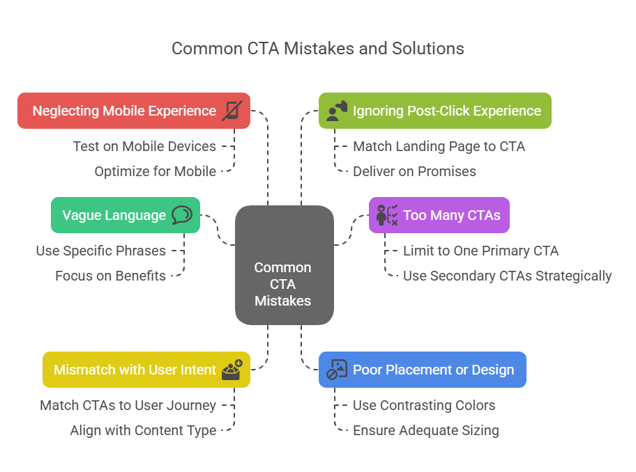
Using vague language is perhaps the most common CTA mistake. Phrases like “Click Here,” “Submit,” or “Learn More” don’t tell people what value they’ll get from taking action. Always focus on the benefit or outcome rather than the action itself.
Instead of “Click Here,” try “Download Your Free Template.” Instead of “Submit,” use “Get My Custom Quote.” Instead of “Learn More,” try “See How We Cut Costs by 30%.” The difference in specificity makes a huge impact on performance.
Having too many CTAs on one page creates decision paralysis. When everything is a priority, nothing is a priority. People get overwhelmed by choices and often end up choosing nothing at all.
Limit yourself to one primary CTA per page, with possibly one or two secondary CTAs that serve different user segments or stages of the buying journey. Your primary CTA should be the most visually prominent and aligned with your main page goal.
CTAs that don’t match user intent are a major conversion killer. If someone is reading a blog post about beginner marketing tips, hitting them with a CTA for your premium enterprise software doesn’t match their current needs or awareness level.
Match your CTAs to where people are in their journey. Educational content should lead to more educational offers (like guides or webinars). Product pages should focus on purchase or trial CTAs. About pages might focus on contact or consultation CTAs.
Poor placement or design can make even great CTAs invisible. If your CTA button is the same color as your background, uses tiny text, or is buried at the bottom of a long page, people simply won’t see it.
Make your CTAs visually distinct with contrasting colors, adequate sizing, and strategic placement. Use whitespace to make them stand out, and consider the natural flow of how people read your content.
Not testing mobile experience is increasingly costly as mobile traffic grows. Your CTA might look perfect on desktop but be impossible to tap on mobile, or the text might be too small to read comfortably.
Always test your CTAs on actual mobile devices, not just desktop browser emulators. Make sure they’re easily tappable, load quickly, and lead to mobile-optimized landing pages.
Ignoring the post-click experience undermines even the best CTAs. If someone clicks “Download Free Guide” and lands on a page asking for 15 pieces of personal information, you’ve broken the trust your CTA created.
Ensure your landing pages match the promise and tone of your CTAs. If your CTA emphasizes “free” and “quick,” your landing page should deliver on both promises with minimal friction.
Bonus: Free Tools and Templates
Creating effective CTAs becomes much easier when you have the right resources at your disposal. Here are some valuable tools and templates that can help you implement everything we’ve discussed.
Design Tools for Creating CTA Buttons: Canva offers free button templates that you can customize with your brand colors and text. Figma provides more advanced design capabilities if you want pixel-perfect control. Even simple tools like PowerPoint or Google Slides can create effective CTA buttons for basic needs.
A/B Testing Platforms: Google Optimize integrates seamlessly with Google Analytics and offers free A/B testing capabilities. For more advanced features, consider platforms like Optimizely or VWO, which provide detailed testing and personalization options.
Analytics and Tracking: Google Analytics 4 is essential for tracking CTA performance and conversion goals. Hotjar provides heatmaps that show exactly where people click on your pages, helping you optimize CTA placement. For email CTAs, most email platforms like Mailchimp, ConvertKit, or Constant Contact include built-in click tracking.
CTA Copy Templates: Having a library of proven CTA phrases can speed up your creation process. Consider building a swipe file of effective CTAs you encounter, organized by industry, goal, and platform.
[Action Verb] + [Value/Benefit] + [Urgency/Curiosity] = Effective CTAExamples:
• “Download” + “Free Marketing Checklist” + “Today” = “Download Your Free Marketing Checklist Today”
• “Start” + “Free Trial” + “No Credit Card Required” = “Start Your Free Trial (No Credit Card Required)”
Landing Page Builders: Tools like Unbounce, Leadpages, or even WordPress page builders can help you create landing pages that match your CTA promises. The key is ensuring a seamless experience from CTA click to conversion completion.
Color Psychology Resources: Understanding how different colors affect user behavior can improve your CTA performance. Resources like Adobe Color or Coolors.co can help you choose effective color combinations, while color psychology guides can inform your choices.
CTA Testing Tools: Beyond traditional A/B testing platforms, tools like Crazy Egg’s A/B testing feature, Convert.com, and even WordPress plugins like Thrive Optimize can help you test different CTA variations quickly and efficiently.
Remember, tools are only as good as the strategy behind them. The best CTA tool in the world won’t help if you haven’t clearly defined your goals, understood your audience, and crafted compelling offers that provide real value.
Final Thoughts
We’ve covered extensive ground in this guide, from the basic definition of CTAs to advanced optimization strategies. The key takeaway is simple: effective calls to action are bridges that connect your audience’s needs with your solutions.
A strong CTA is one of the fastest ways to improve engagement, conversions, and even SEO performance. It’s not about being pushy or overly promotional—it’s about being helpful and clear about how people can get more value from your business.
Start implementing these strategies gradually. Pick one CTA on your website that gets decent traffic, and test a simple variation. Maybe it’s changing “Submit” to “Get My Free Quote,” or switching from “Learn More” to “See How It Works.” Small changes often produce surprisingly significant results.
Remember that CTA optimization is an ongoing process, not a one-time task. Consumer preferences evolve, your business grows, and new best practices emerge. The companies that consistently see the best results are those that make CTA testing and optimization a regular part of their marketing routine.
Most importantly, always keep your audience’s needs and experience at the center of your CTA strategy. When you genuinely focus on helping people achieve their goals, conversion optimization becomes much more natural and effective.
